If a course feels easy to start and simple to follow, you’re far more likely to finish it. That matters because 84% of digital projects fail primarily due to poor adoption caused by complex or non-intuitive systems, and global digital transformation spending is projected to reach $2.8 trillion by 2025.
A user friendly interface is like a good teacher: clear, patient, and there to help you succeed without confusion. If you’re looking at traffic school because of a ticket, a court deadline, or an insurance requirement, that kind of design isn’t a bonus. It’s part of the support system.
You may be busy, irritated, or a little nervous about choosing the wrong course. You may also be wondering whether an online course will be easy enough to use on your phone, clear enough to follow after work, or calm enough to handle when you’re already stressed.
That’s the reason interface design matters. In online traffic school, the screen is your classroom, your guide, and often your first impression of whether the course respects your time.
What Is a User Friendly Interface Anyway
You’ve probably used a website that made a simple task feel harder than it should be. You click one button and end up on the wrong page. You try to log in and get an error message that explains nothing. You look for the next step and can’t tell which button moves you forward.
That’s what a bad interface feels like. It turns a basic task into mental traffic.
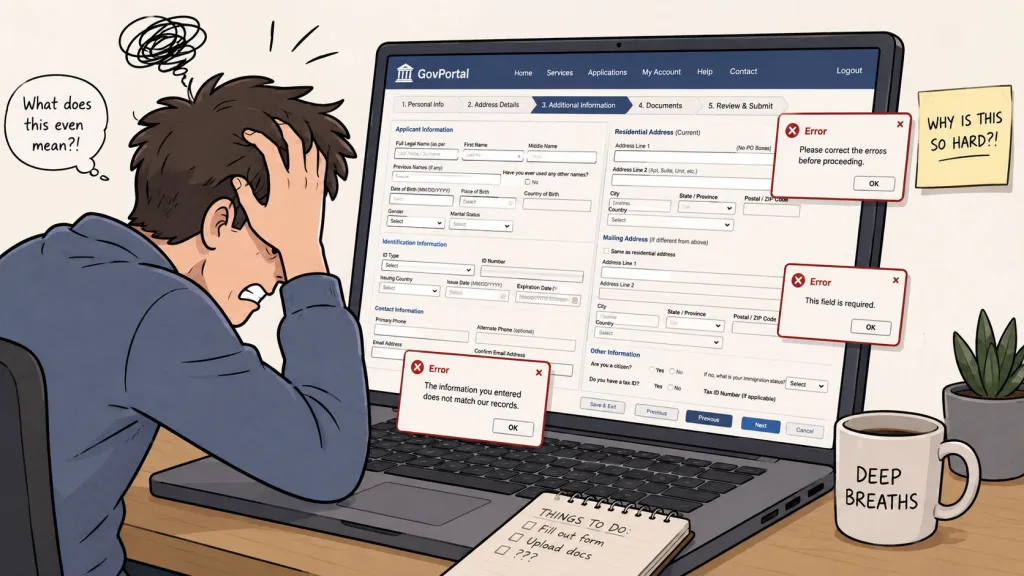
A user friendly interface does the opposite. It works like clear road signs on a route you’ve never driven before. You always know where you are, what to do next, and how to get back if you make a wrong turn.
What it looks like in real life
In a traffic school course, a user friendly interface might mean:
- Clear buttons: “Start Course,” “Continue,” and “Save My Progress” are easy to spot.
- Simple directions: each lesson tells you exactly what to do next.
- Low stress wording: the course uses calm, plain language instead of technical jargon.
- Clean screens: the page shows what matters now, not ten extra choices you don’t need.
People often need this kind of design most when they’re under pressure. Guidance on designing for non-technical, anxious, or older users emphasizes warm language, step-by-step instructions, and minimalist design so people don’t feel overwhelmed in high-stakes situations like resolving a traffic violation, as discussed in this explanation of user-friendly design for stressed and non-technical users.
A confusing interface doesn’t just waste time. It raises anxiety and makes people doubt themselves.
Why this matters before you even enroll
When you’re comparing courses, you’re not only comparing content. You’re also comparing the learning environment.
If you want a broader primer on understanding user interface design, it helps to think of design as communication, not decoration. A clean layout, readable text, and predictable navigation tell you, “You can handle this.”
For drivers who want a simple online format, online driving school options show how course structure and navigation affect the learning experience just as much as the lessons themselves.
Why a Great Interface Is Non-Negotiable for Success
A course can have accurate information and still fail the student. That happens when the system is hard to use.
The strongest proof is blunt. 84% of digital projects fail primarily because people don’t adopt complex or non-intuitive systems, not because the underlying technology is weak, according to digital adoption statistics. In other words, if people can’t comfortably use the tool, the tool doesn’t solve the problem.

That lesson applies directly to online traffic school. Students don’t need more friction. They need a course that helps them start quickly, understand the material, and complete the process without second-guessing every click.
Stress changes how people use websites
When you’re shopping casually, a clunky website is annoying. When you’re trying to meet a court requirement, it feels riskier.
People in traffic school often arrive with a deadline, a violation notice, or concern about points and insurance. In that moment, the interface becomes part of the educational experience. A clear layout lowers mental clutter. A confusing layout adds more of it.
Think about driving in a construction zone. If the signs are obvious, lane markings are visible, and detours are marked early, you stay calm. If the signs are late and unclear, even a careful driver gets tense.
Good design protects your time
A strong user friendly interface helps in practical ways:
- It reduces hesitation: you don’t waste energy figuring out where to begin.
- It supports completion: you can leave and come back without feeling lost.
- It cuts repeated questions: fewer students need help finding basic answers.
- It keeps attention on learning: the course content stays in the foreground.
That’s also why organizations invest in better support flows and automation. If you’re curious how digital systems can solve your repeat-question problem, the same principle applies to course design. When the experience is clear, people don’t need to ask the same “Where do I click?” question over and over.
Practical rule: If a course makes you think about the interface more than the lesson, the interface is getting in the way.
Drivers comparing formats often notice this difference most in a Florida defensive driving course online, where convenience only helps if the system is easy enough to use during a normal workday, on a laptop, or on a phone between errands.
The 5 Pillars of a User Friendly Experience
Design experts often describe usability through five components: learnability, efficiency, memorability, low error rate, and satisfaction. Top-tier interfaces score above 80 on the System Usability Scale, which represents excellent usability, according to Maze’s usability metrics guide.
Those technical terms are useful, but most students understand them faster with familiar examples. In plain language, a user friendly interface usually stands on five everyday pillars.
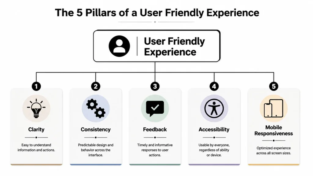
Clarity and consistency
Clarity is like a road sign with large letters and one clear direction. You don’t slow down to decode it. You understand it at a glance.
In a course, clarity means the lesson title makes sense, the next button is obvious, and the page doesn’t bury the important instruction in a long block of text.
Consistency works like traffic signals. A red light always means stop. You don’t want every intersection to invent its own version.
In online learning, consistency means the menus stay in the same place, buttons look familiar from page to page, and the course doesn’t suddenly change its style halfway through.
Feedback and accessibility
Feedback is your dashboard. When you press the brake, you expect the car to respond. When you use cruise control, you expect confirmation.
A course should do the same. If you finish a lesson, it should show that your progress was saved. If you answer a quiz question, the system should respond clearly. Silence creates doubt.
Here’s a useful walkthrough on interface basics before the next two pillars.
Accessibility means more people can use the course successfully. That includes readable text, clear contrast, understandable wording, and layouts that don’t assume every student is highly technical or using a large desktop monitor.
Good accessibility doesn’t only help people with formal accessibility needs. It helps tired people, older people, distracted people, and first-time online learners too.
Mobile responsiveness
A lot of people start a course on one device and continue on another. That’s normal.
Mobile responsiveness means the course adapts to the screen you’re using. Text stays readable. Buttons stay tappable. Menus don’t break or disappear on a smaller display.
You can see how this matters in self-paced online courses. Self-paced learning only feels flexible when the interface stays steady across devices and sessions.
Here’s a quick way to remember the five pillars:
| Pillar | Driving analogy | What it means in a course |
|---|---|---|
| Clarity | Road signs | You know what to do |
| Consistency | Standard traffic signals | Pages behave predictably |
| Feedback | Dashboard response | The course confirms your actions |
| Accessibility | Controls within easy reach | More people can use it comfortably |
| Mobile responsiveness | Mirrors adjusted for your seat | The experience fits your device |
A User Friendly Interface in Action at Driving School
It helps to move from theory to the actual screen in front of you.
When a driving course is designed well, you feel guided without being micromanaged. The course doesn’t show off. It gets out of the way so you can focus on learning, finishing, and moving on with your day.

Small details that reduce stress
Consider the difference between two buttons:
- Vague: “Exit”
- Helpful: “Save My Progress and Log Out”
The second version answers the question in your head before you ask it. Will I lose my place? Can I come back later? That’s interface design doing teaching work.
The same goes for a visible progress bar. A student who sees “Lesson 3 of 8” usually feels more in control than a student who has no idea how far they’ve gone. Direction reduces tension.
The best interface sometimes feels invisible
Some of the most helpful design choices happen behind the scenes. A strong interface doesn’t always add more visible features. Sometimes it removes steps.
That idea is central to thoughtful UX work. A guide to reducing interaction through better interface design argues that the most user-friendly systems often hide technical complexity and show options only when they’re relevant. For driving school students, that can include automating tasks such as certificate reporting to the FLHSMV instead of making the user manage every final step manually.
Less clicking can be better design. If the system can handle a task safely in the background, the student shouldn’t have to wrestle with it.
That’s why one practical option is BDISchool, which offers fully online, self-paced traffic school courses and states that certificates are issued electronically and reported directly to the FLHSMV. In this kind of setup, the interface isn’t just a screen layout. It’s part of how the administrative burden gets reduced for the student.
What good course design feels like
A user friendly interface in driving school often includes:
- A calm start: registration doesn’t feel like filling out tax forms.
- One next step at a time: the course doesn’t flood you with choices you don’t need.
- Readable lessons: short sections are easier to absorb than dense text walls.
- Clear recovery: if you pause, sign out, or switch devices, it’s easy to continue.
That last point matters more than many course providers realize. Most students aren’t sitting down with a whole afternoon free. They’re fitting traffic school into lunch breaks, evenings, and weekends. A good interface respects that reality.
Your Checklist for Choosing a Stress-Free Course
You don’t need design training to spot a course that will waste your time. You just need a few practical questions.
When drivers compare online courses, they often focus only on price or course length. Those matter. But if the interface is clumsy, the cheaper option can become the harder option.
Ask these questions before you register
Use this checklist when you evaluate any online traffic school:
- Can I tell where to begin right away? If the first screen feels cluttered or vague, the rest of the course may feel the same.
- Can I see my progress clearly? A good course shows where you are and what remains.
- Do the buttons say exactly what they do? Labels should remove doubt, not create it.
- Can I leave and return easily? Busy drivers need a course that fits real schedules.
- Does the layout stay consistent from page to page? Predictability helps you move faster.
- Is the writing plain and calm? You shouldn’t need to decode legal-sounding instructions.
- Does it work well on a phone or tablet? Many students won’t finish on a desktop alone.
- Are there fewer steps where fewer steps make sense? Smart systems remove unnecessary tasks.
Watch for warning signs
Some course pages look acceptable at first glance but become frustrating after a few minutes. Common signs include:
| Warning sign | What it usually means |
|---|---|
| Too many choices on one screen | The course may overload you |
| Long, dense text blocks | Reading will feel slower and heavier |
| Unclear login or resume process | Returning later may be frustrating |
| Generic error messages | Fixing problems may take longer |
| Tiny buttons on mobile | The course wasn’t designed for real-world use |
Choose a course that lets you think about driving habits, not one that forces you to troubleshoot the website.
A stress-free course should feel like a well-marked route with sensible exits, not a maze. If you feel confused before you even enroll, trust that reaction. The interface is already teaching you what the experience will be like.
Frequently Asked Questions About User Friendly Courses
I’m not good with computers. Can I still complete an online course?
Yes, you probably can, if the course is designed for typical people and not just heavy computer users.
A user friendly interface relies on plain wording, obvious navigation, and predictable steps. That matters a lot for students who are older, anxious, busy, or are not interested in learning a new system just to finish a driving requirement.
How does a user friendly interface help with test anxiety?
It lowers avoidable stress.
When students know where they are, what comes next, and whether their progress is saved, they can focus on the lesson instead of the mechanics of the website. Clear design won’t remove every worry, but it won’t add extra confusion on top of it.
Does simple design mean the course is less thorough?
No. Simple design and weak content are not the same thing.
Consider a clean windshield. It doesn’t change the road. It helps you see the road better. A good interface makes the material easier to absorb because the presentation isn’t fighting for your attention.
Why do simple interfaces matter so much now?
Because ease of use drives adoption.
Projected global AI adoption is expected to reach 378 million users in 2025, up 20% from 314.4 million the previous year, and that growth is tied to simplified interfaces that help non-technical users access the technology, according to global AI adoption projections. The same lesson applies to online education. When a system becomes easier to use, more people can benefit from it.
What should I care about most when comparing courses?
Look at the full experience, not just the checkbox requirement.
A smart choice usually includes:
- Clear lessons: easy to read and easy to resume
- Simple navigation: no hunting for the next step
- Flexible pacing: useful if you’re balancing work and family
- Low-friction completion: fewer administrative headaches at the end
Is the interface really part of the learning support system?
Yes. In online traffic school, the interface often replaces the in-person cues a classroom instructor would normally provide.
It tells you where to start, what matters now, whether you’re making progress, and what to do next. When that guidance is built well, the course feels more supportive from beginning to end.
If you want an online traffic school experience that respects your time, reduces confusion, and helps you move through your requirement with less stress, explore BDISchool. You can review the available courses, choose the format that fits your situation, and start a self-paced program designed to be clear, flexible, and easier to use.